Time for the second instalment of the Evolution redesign saga. My first run threw out some ideas and generated some really useful feedback (thanks for that, everyone). Since then, I’ve gone back and developed the designs into something a little more coherent and much more Evolution-y.
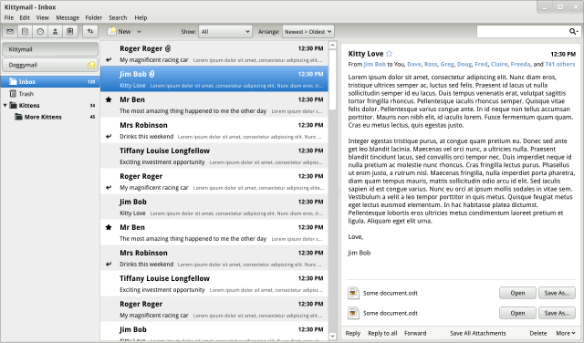
The main window now has a three-pane design, which should be familiar to Evolution users, and which is great for efficient browsing. I’ve included Evo’s switcher for changing between email, contacts, the calendar and so on, though it has been tweaked and relocated. (Click on the images to view them full-size.)
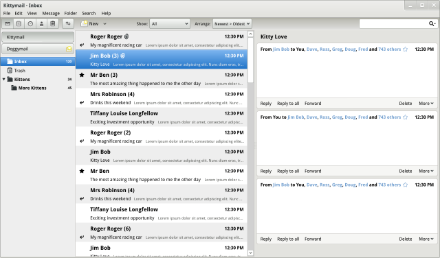
I’ve shown how a threaded view could be done. Real, proper threading. That would be nice, wouldn’t it?
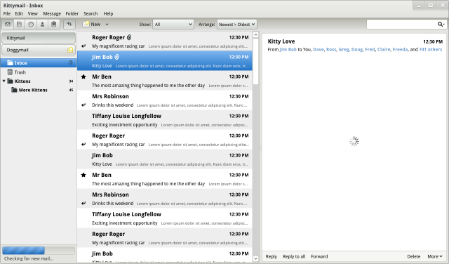
Some elements from the previous designs have been retained. I’ve used the same approach to progress information: the status bar is gone; in its place, there are inline throbbers and a Banshee-style popup progress bar. This approach communicates the desired information much more effectively.
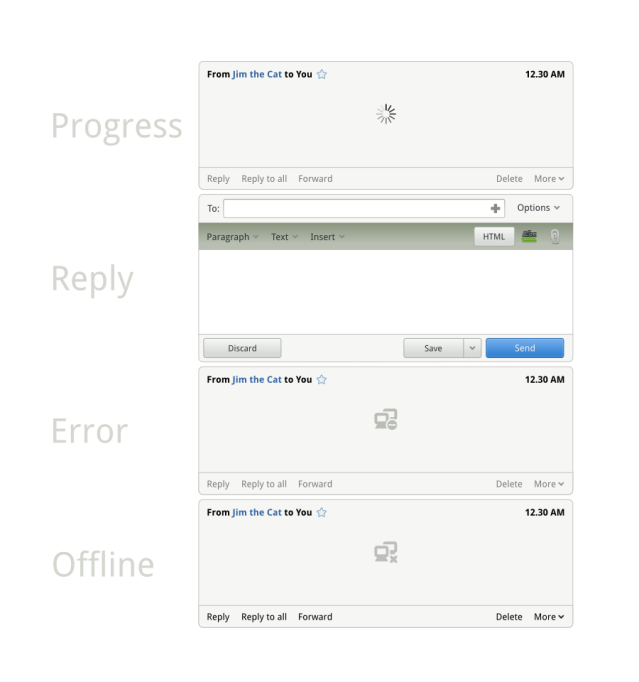
Another pattern that I’ve continued from the original designs is the use of inline status information and replies.
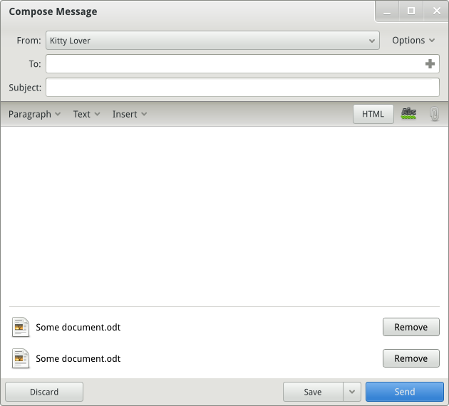
The composer design is more or less the same, though I have elaborated how attachments could be handled. It’s so much simpler than the current design.
This second iteration is not so much a radical redesign as an aggressive refinement of the current Evolution interface. There are many minor changes, none of which is a radical transformation on its own, but whose combined effect (I think) would be dramatic.
I can provide specs for some or all of the changes detailed in these designs, should any developers be interested in implementing them. Many thanks to Jimmac for helping to make the mockups look good!


Those are really gorgeous! Can’t wait to see this implemented in Evolution. This would definitely make me switch back from Thunderbird to Evolution!
Very cool indeed. I’m wondering if all those redesigns you guys are doing are been taken by developers.
Pingback: Evolution, re-evolvedafaik | 9nd.pl
Evolution should use a conversations view instead of inbox, sent box, etc. + threaded view. A conversation view would show all conversations in threads and also include my own replies.
That would make it easy to follow long running threads and make inboxes obolete, at least for the default view on the mail.
@lariq: that would make a cool email client, but it might not be the most appropriate approach for Evolution.
But at least this could be a (for sure) popular view on the mail handled by evolution. And it could be addtionally used.
I don’t use any mail client that doesn’t default to this. Period.
Gmail is the most popular mail client on Ubuntu, or at the very least, webmail is. After webmail is Thunderbird, despite that it’s XUL. Evolution, though being *installed by default* and the *default mailto: handler* ..is third.
So I’m thinking I’m not alone. Conversation view is feature 0.
I liked your first attempt better. I don’t think that I need the list of e-mail titles, and it uses up a lot of space. You lost some of the elegance that you had in the original design.
BTW: I didn’t fully understand why “kittens” and “more kittens” were nested, but maybe I have been too long away from evolution.
BTW: Is there a technical limitation that prevents the client from using gmail-style labels instead of folders? That would be supercool to have. And I would like my client to encourage me to use this feature.
If you could get anywhere near close to that it would be impressive.
That looks fantastic. Very navigable, easy to follow threads.
Good Work!
How come you don’t nest the message list? As it is it’s impossible to tell that the threaded screenshot is actually threaded without clicking an e-mail.
PS: I really hope there will be support for using old-style message lists without the previews on the side (it eats a LOT of space) and also support for conversation view that includes my own messages.
@David Weinehall: including individual messages in the threaded list introduces a lot of noise. Plus, nesting the messages messes up the layout.
Threads are indicated by a number in brackets after the subject line; maybe a stronger indicator is needed, though?
What if the subject has a bracketed expression already? Some kind of visual distinction is needed between text in the subject and text appended to the subject to indicate something else.
In the threaded example pic, I can’t see any threads…
What messes up the layout when doing nesting (or tree-view, if you prefer)? It’s still the only sensible representation of thread flow I’ve ever seen, and it’s perfectly intuitive.
The information I need to quickly find a message in my inbox is usually:
* Mail status (read/unread, important/normal prio) — this can be encoded with text properties
* Sender
* Subject (as long as the thread keeps the same subject this can be ellipsized in followups, and “Re: foo, was: bar” can ellipsize the was: bar” as long as it stays nested at the expected depth
* Date
I don’t view the e-mail in preview mode, and I didn’t mean to suggest having nesting in the preview pane. An “Open as conversation” view would be very nice however, and in such a view nesting would make a lot of sense.
I had a difficult time telling how the messages were threaded in the threaded view (who is replying to whom?) and I couldn’t imagine how this look would handle more complex trees of messages and still show proper threads.
In Thunderbird I can see the tree with the lines that connect messages; I know exactly who replied to whom. Perhaps there is some way to show the connection between messages that would still fit in aesthetically with what you’re aiming for?
As for moving messages across accounts, wouldn’t it be okay to select messages and right-click on the selection to pick something like “Move to” -> “Kittymail”? I’m assuming Kittymail and Doggymail are the mail accounts.
You’ve got some significant looking improvements overall, thanks!
I can see a problem: what about moving messages between mail accounts? I like to use the old “drag & drop” method 😉
Besides that, the thread message list with preview enabled can be a PITA if you’re in a long thread with IMAP over a slow connection 😦
Anyway, you’re almost there. Keep on good work!
@Juanjo: the accounts bit was one of the more speculative aspects of the design. The advantage of the toggle buttons is that they allow fast switching between accounts – they’re far less taxing than expanders and scrolling. You’re right that you lose dnd between accounts, though. I guess the question is which is most important, and are there any other ways you could enable that dnd behaviour for when it is necessary?
Well, I don’t know about your use-cases, but at work our mail is sadly on an exchange server. This means that any mailbox that grows to more than 100MB or so will cause things to be dead slow. Therefore the admins have quite strict mailbox quotas. Hence I always move the majority of my e-mail to a local mailbox.
I couldn’t care less for fast switching between accounts, because I only have one inbox, but I definitely need the drag and drop support.
Maybe having only the accounts shown by default, and having them popup on dnd-hover, and autoclose again after the drop?
First, the design looks really pretty! I hope to see many of the elements in evolution 3.
Anyway, I feel that the vertical view doesn’t work on some devices (e.g. Netbooks) and I hope the classic view will still exist. I tried to switch to the vertical view in current evolution and it is inconvenient for me because you cannot easily sort by “From” and “Date” which I basically do all the time. And I don’t see how the new design would make that better (apart from searching by date).
But please continue in that direction, I am pretty sure the final design will be great.
@Johannes: yeah, message sorting is pretty broken in the vertical layout. The inclusion of the ‘arrange’ combobox in this design is intended to fix that.
For some reason I quite like opening mails in new windows on my netbook. I think that it might be cool with panes if they could be collapsed in some way, don’t know how to describe this exactly.
I got three words for you!
THIS IS AWESOME!!!!!!
For inspiration, have a look at Sparrow mail app:
http://www.sparrowmailapp.com/
Pingback: Evolution evolved [mock-ups]
I’m not sure I would like thread rappresentation “a la GMail”, with the number of involved mails instead of the plain tree. It is just about the visual impact of the tree, which requires more screen space but provides a strong clue for rapid seek between threads.
I think the ideal email client layout should mimick google reader. In a left-pane you have accounts and folders and in the main pane you have a list of threads. When you click on one (which shows the subject and some of the email contents) it expands to reveal the thread (or part of it, e.g. the last email in the thread). When you click on it again it collapses.
This does away with the unnecessary need to always have a preview pane showing. Ideally the pane should show only when you want, so that you can see more of the emails in your folder. Why nobody uses this sort of layout besides for feed readres is beyond me.
@molecule-eye: you might want to check out the first iteration of these mockups. That could be a good approach for an email client, but I don’t think it’s right for Evolution. The main reason for the preview pane is efficient browsing – it’s particularly well-suited for heavy email users.
Hmm.. but the majority of e-mail users are not heavy e-mail users. We are just normal people 🙂
Maybe the preview pane should be a semi-hidden feature that you can turn on if you are a power user.
Looking much much much better than the current mess.
However, I have few remarks / questions / ideas:
– Why do we insist having menubar? I’d like to see menubar being places as a button somewhere (after all, it’s email and email is the main thing, we don’t use THAT much menubar).
– Why do we want to have completely new window for composing message? I’d like to see something different. Perhaps there should be tabs? Perhaps calendar, contacts, etc. could use this “tab structure” as well. Or perhaps composing could create temporary item to left side below the accounts and stuff (because you need be able to check something from another view, tabs would solve this dilemma too)?
Few things I “hate” currently in Gnome:
– There seems to be a some sort of need to make “everything” look like buttons. There is way too much borders and treeview wouldn’t need to have a white background like it usually has: it could blend nicely if it would just use the same color as other toolbars use as a background.
– Way too much scrollbars. (Gnome-shell and horizontal scrollbar, PFFFFFT, who came up with that idea?). I know this is a bit radical idea which may not even work everywhere but how about copying something from the mobile world: ditch scrollbars, make everything pannable, show scrollbar-like thingy on the right while while panning (to show approximately how long the list is and where the current view is in it).
Anyway, great progress, especially on the right side of the first screenshots. Loving how the mail view looks.
@Jukka: glad you like the designs. It’d be interesting to try and boil down the current Evo menus to something more compact. In terms of priorities, I’d sooner get the rest of the UI into shape first though.
The horizontal scrollbar will disappear from GNOME Shell pretty soon.
One of the advantages of a separate composer window is the ability to keep it on top of other windows (including the evolution main window). I find this particular handy when composing a new message and you have the need to grab information form other applications: it allows you to keep the overview over both what you are typing and the needed information.
Lorem ipsum dolor sit amet, consectetur adipiscing elit. Fusce eleifend posuere leo, sed placerat orci vestibulum id. Nullam vel odio augue, nec facilisis lacus. Suspendisse risus magna, scelerisque laoreet posuere non, aliquam quis mauris. Cras ut lorem risus. Donec tristique elementum feugiat. Quisque rhoncus turpis at felis mollis convallis. Nam eleifend dui rhoncus mauris luctus placerat. Morbi vel vehicula diam. Etiam lorem lorem, egestas at auctor at, posuere a eros. In mollis lorem quis ligula ullamcorper dictum. Suspendisse auctor, neque vitae commodo auctor, nibh ante vulputate neque, a imperdiet sapien tortor eu quam. Praesent rutrum imperdiet sapien non pharetra.
Oh come on… lipsum people
Great work on the redesign! I’d love to see this happen.
I’d like to make a suggestion. Evolution currently does mail, calendar, addressbook and notes in one application window. I guess this is inspired by Outlook (and good old Netscape), but it’s unintuitive. Apple uses separate applications for these, which makes more sense from a usability point of view. Can the evolution GUI be split in separate windows? No more switcher on the bottom-left of the window and create separate launchers in the GNOME menu. They can still all use the evolution-data-server backend.
+1
+1
❤ ❤ ❤ ❤ ❤ ❤ ❤ ❤ ❤ ❤ ❤ ❤ ❤ ❤ ❤ ❤ ❤ ❤ ❤ ❤ ❤ ❤ ❤ ❤ ❤ ❤ ❤ ❤ ❤ ❤ ❤ ❤ ❤ ❤ ❤ ❤ ❤ ❤ ❤ ❤ ❤ ❤ ❤ ❤ ❤ ❤ ❤ ❤ ❤ ❤ ❤ ❤ ❤ ❤ ❤ ❤ ❤ ❤ ❤ ❤ ❤ ❤ ❤ ❤ ❤ ❤ ❤ ❤ ❤ ❤ ❤ ❤ ❤ ❤ ❤ ❤ ❤ ❤
It is amazing how these mockups are much more polished than the current evo and yet they make only small changes to the the overall underlying schema.
This is outstanding!!
The only drawback for me is the account pane, as commented before it kills drag and drop
This already looks quite awesome! I just have one remark.
Why you highlight the names more than the mail subjects. I think the subject often matters more, than the person who wrote the email. The big names only make sense for private emails.
But if you think about mailinglists and thread views, it would be far more logical to put the subject first. A whole thread has only one subject, but can have many people participating. So you could have a big subject font. And in the somwhat smaller line underneath you could already show the participants of this thread.
Way better than last time. I like it !
Maybe something is missing: when look at a thread of discussion, what would be really useful is, on the preview panel, to have just a long scrollable list of mails. So no more click-click to open a succession of answers to a mail, just scroll the whole lot and read.
To be really efficient though, Evo should recognize what part of a mail is just citation of the previous one, and hide that automatically.
Less clicks => more efficient workflow.
Question: how do you plan to manage encryption/signing (for single message, of course)? Maybe the “Options” widget? BTW how should “Options” widget work? As a menu?
@Luca Ferretti: yes and yes
I really like the design, although I’m not sure if the buttons to select the the active email account are the best option. I personally also use the D&D feature between mailboxes. The interface might also become ‘bloated’ on smaller screens with a few active mailaccounts.
One suggestion regarding the composing window: some more options should be available to the user without the need for clicking. I assume you can select font, size, bold, italic,… from one of the three drop down buttons. However, features like text markup (bold, italic, underlined) and options to structure your message (bulleted list, numbered list) should be available directly.
Keep up the good work!
Kurt
Thank you for this beautiful interface. I appreciate it very much.
It’s so wonderful. I wish it was in my Evolution too 😦
Please don’t forget 1024×600 netbook screens. It’s easy to forget about us, but Evolution is completely unusable in such screens right now.
Unfortunately, these mockups appear to suffer from pretty much the same issues: they simply don’t fit into a netbook monitor.
I have to agree, the horizontal space just goes straight out the window with this view. Also, it is a bit jarring to me. It’s not apparent on how to do anything with the message other than just read it from the mockups. Oh, wait, it’s at the bottom of the message, where the status information would normally be.
I’d be interested to see more, but I think the usability is once again being thrown out in favor of cool.
The only reason I can think of for having the reply button on the bottom instead of on the top would be that people actually read the email before replying!? 🙂
I would really appreciate seamless vim/gvim integration for message composing.
Yes, yes, yes! That’s one of the main reasons I still use mutt for all of my personal e-mail (I use evolution for work due to exchange).
Imagine a FUSE based mail client, where you browse your mail folders with your normal file browser, and compose with your editor, and to send a mail you just drop it into a special outbox folder.
As others have already said, I’m worried about the GMail-like threaded view.
Threads are awesome when displaying a conversation of back-and-forth emails between two people.
But for discussions involving several people, each one replying to a different email, it becomes incredibly messy, since it gets difficult to see quickly what message is a reply to what other message.
For this use-case, nested tree-view works much better (although it is certainly not perfect).
This is actually a pretty common use-case, either on high traffic mailing-lists for open-source projects, or at work, when a discussion between non email-savvy people quickly starts including half of the company.
I propbably should have mentioned that other than this worryness about the thread view, the mockups look gorgeous!
I can’t wait for Gnome 3. 🙂
Pingback: Evolution evolved « Alex Carrega
My only wish for evolution is to split up the different components (mail, addressbook, calendar, …) in different apps.
Other than that the mockups are a good step forward.
I’m glad to see Evolution getting some updating and polish. It’s a great program marred by a clunky UI 😦
Pingback: Evolution: ecco un nuovo ed interessante mockup grafico! | TUXJournal.net
Pingback: L’evoluzione di Evolution « GNUpress!
Coversation view would make me a happy man 🙂
I’ve lifted my eyebrows last time you wrote about this Evolution-evolution stuff, and said “bah, he will never make it”. Now that I read that one again, and after that I read this article, I have one question left. When can I use it? 🙂 Conversation view is everywhere nowadays: my iPhone uses it. My Windows Mobile phone uses it. My GMail accounts use it. Why should Evolution? So I’m with you, if you need people to vote for this design 😉
Can i say: Mockups look 100% better with the new GNOME3 theme! Nice change from clearlooks or faux-mac 🙂
For attachments I think you don’t need a button for “safe as…” or “open”. For open just click on it, for safe as use drag&drop.
Lindo lindo lindo, muitissimo bacana, otima interface e mto clean!
Gorgeous gorgeus gorgeous, very much cool, great interface and very clean!
Pingback: Evolution Mockups by Allan Day - Tux-planet
Pingback: Evolution evoluciona | MuyLinux
Nice! I really like it. I hope this will be on my desktop some day 🙂
Keep up the good work!
Hello. What tool was used to make these? Thanks.
Yeah, I am so glad I decided to use Gnome. These look amazing. If even a fraction of this hits real use I will be impressed. Great job.
This looks great. Here are some more comments
The inbox might be hard to read on small screens. Perhaps it is might be better to split it in to two views so that you either show the titles or a single conversation. (Copy Google)
The inline inline conversation view would be easier to read if some of the edges on the boxes were removed. (But the placement of widgets is very nice)
Perhaps the attachments in the compose window could be placed on a single line. They seem to use a lot of desktop space. (Copy gmail and outlook)
Hi Allan,
Any news about when this will be placed in Evolution? The development team really liked this idea and will implement it?