
The GNOME 3.8 release kept me pretty busy. In the run up to UI freeze I was focusing on tracking bugs, providing guidance and testing. Then it was marketing time, and I was spending all my time writing the release notes as well as some of the website. (Kudos to the marketing team for a great 3.8 release, btw.)
With 3.8 behind me, I’ve been able to turn back to some good honest design work. I’ve been looking at quite a few aspects of GNOME 3, including Settings and GNOME Shell. However, in this post I am going to focus on some of the application design activities that I have been involved in recently. One of the nice things here is that I have found the opportunity to fill in some gaps and pay some attention to some of the long-lost applications that are in need of design love.
Contacts
I haven’t blogged about Contacts for a while. 3.8 was a great release for the application though, mostly thanks to some fantastic work by Erick Pérez Castellanos. We got a new editing UI and a new selection mode, as well as a new linked accounts dialog. Along the way many of the most prominent usability bugs were fixed. Thanks to Erick for making this happen.
The Contacts designs have been slowly evolving since they were first conceived, and they have turned into something that I am really happy with. I spent a bit more time on them recently, with some updates to the toolbar and a few other things.


Character Map
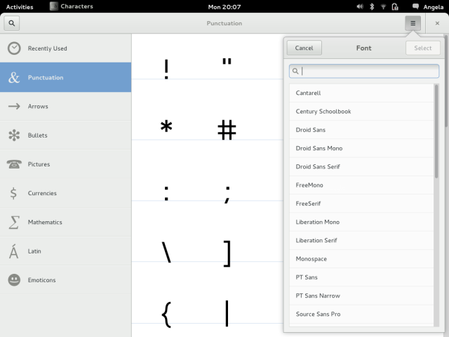
I use the GNOME Character Map on a fairly regular basis, and it has to be said that it could do with some love. I’ve been meaning to do a redesign for quite some time, and I finally found the opportunity a few weeks ago.


The most important thing about the design, in my opinion, is that it provides an easy way to browse different types of characters. This alone will make a huge difference to the experience. Another nice feature is the recently used section, since I think that most people have a small set of characters that they keep going back to.
Web Apps
I think that web applications could be pretty important for GNOME in the future, and we already have a great foundation on which to build here. I recently took a look at how web apps could have toolbars of their own, which resulted in the following mockups.
The web app toolbars are pretty simple – back, forward, reload and close.
Cheese
Last summer I had the pleasure of mentoring Fabinia Simões, who did a great job redesigning Cheese. In the past few weeks I’ve revisited her designs and done a set of hi-resolution mockups. We’re continuing to discuss some of the details, but I’m increasingly happy with the design.


One interesting thing to note about this design is how the navigation design patterns that we’ve developed for GNOME 3 applications are able to help even with a simple application like Cheese. Having a set of patterns like this really helps to reduce the work involved in designing (or in this case, redesigning) applications, as well as leading to consistency for users.
Transfers
Transfers is a new application for GNOME 3. It’s like a download manager, but it handles other things like copy/move operations for files and file transfers from Chat contacts. In some ways it isn’t the most exciting application, but it will fill in an important blank in the content story, and will make it easy to find content that you have received from other people and places.

These mockups are still a little rough, but they are a good place to be starting.
So what’s the story with the close buttons?
Those of us who work on GNOME design have been pushing to reduce the presence of window titlebars for some time. The main driver for this is to use screen space more efficiently. The average titlebar includes big swathes of empty space, and they take up valuable vertical pixels. We’ve already seen the result of this direction in our treatment of maximised applications, where the titlebar is hidden.
Now that Wayland and client side decorations are on their way, we are able to realise our ambitions for screen efficiency even further. So far we have only been able to hide the titlebar when windows are maximised. In the new world of Wayland, windows can permanently lose their titlebars, whatever state they are in. Not only that, but they can also present window controls – like the close button – inside the window itself. This means that we can consistently show the close button on the right side of the toolbar, whether the window is maximised or not.
One of the drivers for my recent application design work has been to test out this approach to titlebars in an array of different contexts, and me and the other designers will continue to examine how it will work in different applications as we move forward.
As always, these designs are in a process of evolution, and feedback is welcome.

Hi, any news on sigle-window Empathy (or Chat)?
Thanks,
Antonio
We have the designs; I’m hopeful that we’ll make some devolpment progress soon, although I can’t make any promises.
Gonna be honest, I freaking love Empathy, but it really does need a UI overhaul. If that could be done, even by 3.10…that’d be amazing.
I assumed that the final objective was to use a client side close button when maximized, for now I am using the Ignore_request_hide_titlebar extension. Have you tried to restore the window size of a maximized Web window (3.6), yes some people have big monitors and don’t want to use a maximized web browser all the time. It is not easy, you need to move the pointer to the small areas where no control is located. Try to do that in a touch environment and you will go nuts.
Hi Robert, I’m looking at that bug as we speak. 🙂
It’s actually even worse with Epiphany web apps – where you don’t have any title bar at the moment. I know two ways know to resize these windows – Meta–Down Arrow or Meta–Drag. Neither of them is particularly discoverable, and both are impossible without a full keyboard.
Eigenvektorz, which is why I was doing mockups for web app toolbars. 😉
To restore a window without title bar (maximized), simply click on an empty area of the top bar (the black one) and drag down.
Current design of the close button is way too big and intrusive. Needs fixing.
Did you read the section entitled “So what’s the story with the close buttons?”?
One of the things I am excited about is how application switching in each workspace will work with the new headerless windows. Also, how much headerless application windows will change at which point it is necessary to use another workspace. What are you thoughts on this, Allan?
Hey Bastian, I’m not entirely sure what you mean… I don’t expect anything to change other than the size of the windows and the placement of the close button; the window manager menu will be avaliable from the toolbar.
Hi Allan, what I meant was that with no headers I assume you also remove the middle-click “send-to-window-to-back” feature. I rely on it to switch windows because it means I can switch between one maximized window and several small windows easily (in contast to alt+tab / overview). The feature defines how I manage workspaces – I keep either 2 maximized windows or 1 maximized and 4-5 small windows per workspace.
That was what I meant by “how switching applications will work with headerless windows” and “how headless windows will affect workspace organization”. I was referring to the workflow above. Sorry for the miscommunication – it totally slipped my mind you could change windows other ways too.
I just re-shaped my question: In your opinion do you think the send-window-to-back feature will go or will it arrive in a new form in the future?
Who is going to implement Transfer? GNOME should be compatible with KDE’s jobs, they look the same.
Hey Àlex, there’s been some interest in having a GSoC project for Transfers. Your best bet is to subscribe to the design page [1], since nothing has been decided yet.
[1] https://live.gnome.org/Design/Apps/Transfers
I would really, really love if KDE and GNOME shared the same transfer API. It could be especially cool with the future “Linux apps/sandboxes”.
The new designs look neat! However, I wonder if the division of the name in fields is a good idea, especially the middle name; unless it’s dependent on the locale, it might not be suitable for some cultures.
The agree with you that web apps integration will be very important. I guess that the scarce controls could be hidden in the app menu (because they would ideally not be used very much) but this way it’s also nice IMO.
Totally agreed on the multiple fields for names, it just doesn’t work in many places of the world.
Even localizing it wouldn’t really work, especially if you are splitting because of ordering. For example, on a fr_FR system, you’d want to order the names as “Firstname Name”. But that would be wrong for my Chinese contacts, which should be ordered as “Lastname Firstname”.
So the ordering should depend on the locale of the name of each contact, not on the locale of the system displaying the contacts.
And there’s more crazy stuff, which put all together make a strong case for having a single “Full name” field, and letting the user input stuff in the order which makes sense.
This page has a lot of good informations:
http://www.w3.org/International/questions/qa-personal-names
How will it affect current applications like Firefox, Thunderbird, GIMP etc.? Will it work with them like on the pictures or not? And in which release will it land?
Can certainly see the merits of reducing window titlebars, I myself use the extensions Maximus & Window buttons (just the X) in 3.6 to apply that effect on maximized windows.
Not quite sold on web apps though. They may be a thing on the mobile platforms and ubuntu have played with the idea but on the desktop my browser is too fine-tuned for my specific needs and is too deeply engraved into my workflow to ditch for a generic single window approach that could never work with the amount of tab work I do every minute. I feel its one of the things that has to be done from the provider’s end rather than gnome and that doesn’t look likely (wonder how many websites have bothered to create livetiles for Win8?).
Would like to see your plans on GS, not to say that I don’t trust you guys but my current setup is so good I’m getting protective 😀
Will the toolbar have a context menu like current titlebars? I use mid-click on titlebar extensively to cycle quickly through windows, in absence of the old window list, and I’ve found myself avoiding maximization of programs (Files, Web) that already hide the titlebar when maximized, so that I can keep the mid-click mechanism.
That’s the plan, DavidM.
Nice!
Title bars indeed take space, but they are also provide some kind of border between the window controls and upper panel controls. What I have observed is that users sometimes misclick when they are working in a window with no title bar. The controls are just too close to the panel.
Another concern is compatibility with other frameworks and consistency. Believe or not, GNOME users are also using non-GNOME or non-GTK apps. Now, all apps have the same title bar and the same closing button (with a few exceptions such as Chrome). If GNOME integrates the button in the window content, non-GTK apps will have to have some fallback button and title bar, and consistency will be damaged.
I’m not sure if title bars are obsolete on platforms like Linux witch such a larger variety of frameworks.
It’s always nice to follow your design posts!
I don’t understand how is this not a massive waste of vertical space?
JackWhite, are you referring to the height of the toolbar? It’s a lot shorter than a titlebar and toolbar together, and massively shorter than titlebar+menubar+toolbar. But yes, that is a little too tall, and in fact the toolbars we have aren’t as tall as in the mockups.
Just too bad contacts is pretty bad at getting contacts into the app….its terrible tbh. Layout is clunky (atleast in its 3.8 form…) and i always get either too few contacs or too much junk (ie. auto created stuff from google)…
Just a comment on some general design stuff, i recently lost the preferences in Gedit, only to find them back in the application menu. I like the return of the window close buttons even when window is maximized, but doesn’t that (together with the gear menu) make application menu’s completely useless.
From my perspective they are hard to find, and no app uses them the same, gedit still has menu bars, but preferences is completely removed from them and moved to the application menu. My proposal, either fix them, make them consistent, or drop them in favour of the gear menu.
Sorry I don’t really understand what you are trying to do here on this client-side-decoration/close-button thing.
I don’t say it’s useless, I use chromium which uses client-side decoration, it doesn’t integrate well with other windows from my window manager, but the added space is pleasing (it’s only like 8 pixels, though, not that big of a loss, but the window manager title bar doesn’t integrate very well so I keep it that way).
So what is bothering me here is that in all the screenshot the combined title-bar/toolbar is just HUGE. Same thing for the Transfers windows that can only have like 8 entries.
No offense, I guess that I’m too much of a “power” user to understand.
Really, I know that my needs and the needs of some other people can be dramatically different, so Gnome should just be clear which public it is aiming for. In the past it was still good for me but could be hard for beginners, with Gnome3 it looks like Gnome is aiming for a more accessible desktop environment but I think that the communication has not been done on that point, so people like me are still expecting what was done before while development is entirely different.
Sorry for being off-topic like this ! Keep up the good work guys ! Even if it’s not for me, it’s really good to have all this kind of good thing being done in the community !
I don’t understand what you’re talking about, the toolbar in GNOME 3 applications is actually smaller than it was in GNOME 2 applications. Perhaps the close button being bigger is throwing you off?
Not sure I like the character map changes, for two reasons. One, you seem to have ditched the status-bar display which displayed the unicode sequence and name, and also the more detailed view of character information – these things are actually useful to some people, e.g anyone who wants to know they’ve actually got the right character, not just one that looks a bit like it.
And two, you’ve also ditched the traditional groupings in favor of your own – which might seem logical to you, but the old ones were also useful for people wanting to find character ranges that don’t fit your categories – in particular, different alphabets, such as the tourist in Russia who wants to enter Cyrillic text.
In short (and going by the screenshots), you appear to have removed any possible use I’d get from that application…
I remember asking you a while back about the lack of a close button in maximized applications, and I think it came down to the overview being the preferred method of window management activities (including close). I wonder if, on tablets, or in other environments, the close button will simply disappear, or could be switched off universally. This would help a lot to make GNOME applications fit into the future of Wayland more flexibly, as KDE and presumably Ubuntu will stick to separate decorations.
Either way, I love where GNOME is going, and these mockups are making some of the benefits of the new design guidelines quite apparent. I think the only real issue is that we’re not quite there yet when it comes to apps- we still have to prioritize the presentation of non-GNOME apps until things settle down or we find a flexible way to make GTK apps for several environments. Big problems to tackle, sure, but I think the inclusion of the close button in maximized applications will make using GNOME 2 style apps like Eye of GNOME next to new apps less jarring.
Is it possible to make an even bigger window top bar? so I can cover 60% of my screen with it?
Hi Allan, I gotta say I love the direction Gnome is heading. As an Apple Genius and Apple fan, I really have to say that Gnome is becoming what OS X will eventually become further down the road. I like how Gnome implements some nice ideas from iOS and improves upon them. But my concern is that it’s happening at really slow pace.. I mean, there’s like, 8 apps making Gnome platform (from end-user perspective) and these are being updated, redesigned or introduced like, two at a time. It’s too slow, I’m afraid. I know that it’s only as fast as how contributors can, and I would gladly help had I any programming skills, but with really good Windows 8, OS X becoming even more first-time user friendly, and iOS and Android tablets making computers less relevant to many, you gotta pick up speed just to keep up with the pace.
Sorry for criticism.. I really wish you all the best and keep my fingers crossed. On a side-note: Allan, is that you there, on that Cheese screenshot? 🙂
Just a quick question: where do I click on the Contacts app to quickly compose email/start IM with currently selected contact?
Yay for in-window close buttons!
Gnome is finally taking the right direction but there is one thing that you should pay more attention to: the wasted space used by the widgets. For example your Character Map occupies 65% of the screen as is only able to show 30 chars. The Contacts app shows only 10 when maximized. There’s a lot of waste of space.
Please consider this.
Thanks.
Very nice mockup. Keep up the good work.
Hi
Really like the plan, keep up the good word!
What about evince, the interface is starting not to fit with the gnome look (as of 3.6), it should really get some love. I was thinking the number of bars should be reduced. It was be great if it’s made to look like FILEs maximized (everything in one bar)
Thanks though
Just a little suggestion: please don’t forget keyboard users. I find the new designs very appealing, but I hate using the mouse too much, so please add keybindings and a way to find them.
For instance: in Gnome 3.6, in Contacts, I cannot use a key to call a contact. Even if I press the call button with the mouse, there appears a list of phones, and I cannot press Enter to call, I have to use Alt+A, which is a bit annoying.
Hi! Some remarks about web apps on your mockups. Well, there is apps vs Web friction (do you recall Wired: “The Web Is Dead. Long Live the Internet”?). And GNOME 3 is very much oriented at apps. This may be the reason for your mockups, but honestly, closing up any website (web app) in single browser window is pointless because Web is all about links (connection) and browsing from one website to another. Just think about Twitter: most tweets contain link to some external place on the Web. Even more, I can’t find philosophical difference between Gnome Planet and Documents, as both have some content and app characteristics (means to organize or agregate content). I think that Windows 8 with its start screen have some interesting potential because app icons and content elements are on the same level. So I would be glad if Gnome could be more Web (browsing) oriented, too. Will we see something similar in Gnome Shell? At this time, app-oriented desing looks like a constraint on this direction. That being said, thanks for your desing and post!
I really like windows 8 theme and gui something is lacking in gnome as it does not look so good as windows 8 .
Also nautilus requires complete recoding as it is horribly slow and option to queue file transfers and adding priority would be nice.
Just curious… Why are the characters in the table so large?
Also, I’d like to plug keyboard access to all features and controls for those few of us (apparently) who still prefer to use them.